We are kicking Multimedia Week off with a Photoshop post by Leah one of our fine Lab Monitor Supervisors here at the LC.
While we would all love to have our pictures taken, brushed up, and beautified in a professional photography studio, not many of us can afford the cost of catalogue worthy photos and must make do with our Cannons, Kodaks, and iPhones.
I'm going to show you a little tip or two that you can use in Photoshop (or Gimp!) to give your portraits a little extra pop with no extra expense.
*This is beginner level, but it does assume that you can find your way around the main menus of Photoshop and are familiar with the general layout. I will provide pictures to help explain the process.
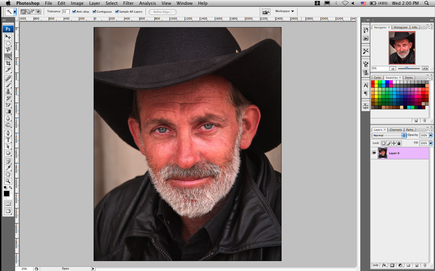
Ok, the first step is choosing your photo. For this example I will be using this guy:
Now, George has a pretty decent picture already, but it could be more interesting so we're going to help him out. Let's get started:
1. Open your picture in Photoshop; You can go to File --> Open… or copy and paste it in, it's up to you.
2. Save As! There's nothing worse than making a mistake on a file and not having a backup of the original.
3. Right click on your photo layer and duplicate it so there are now two copies of the same layer.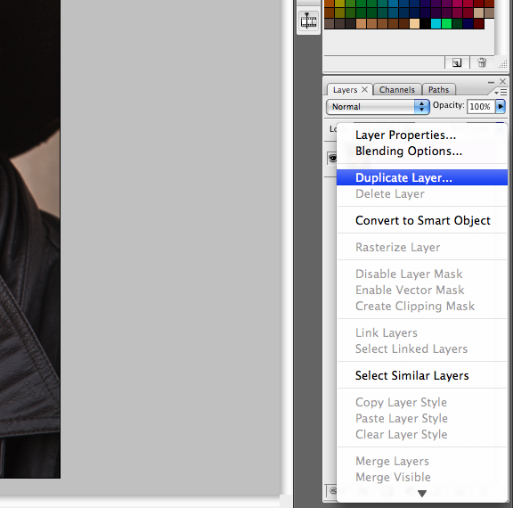
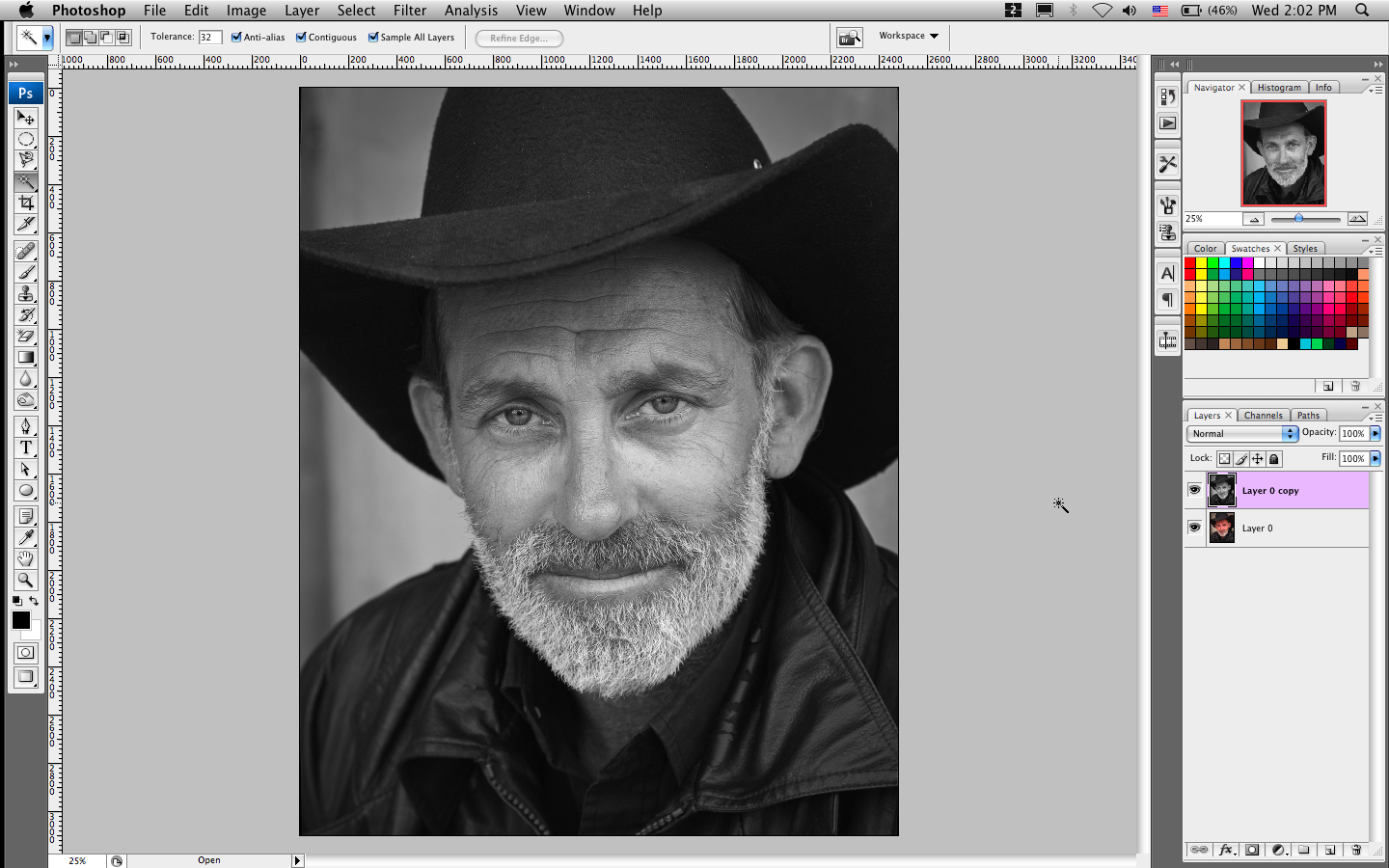
4. Desaturate the copy layer by going to the Image menu --> Adjustments --> Desaturate. Or use the shortcut of Shift-Command-U.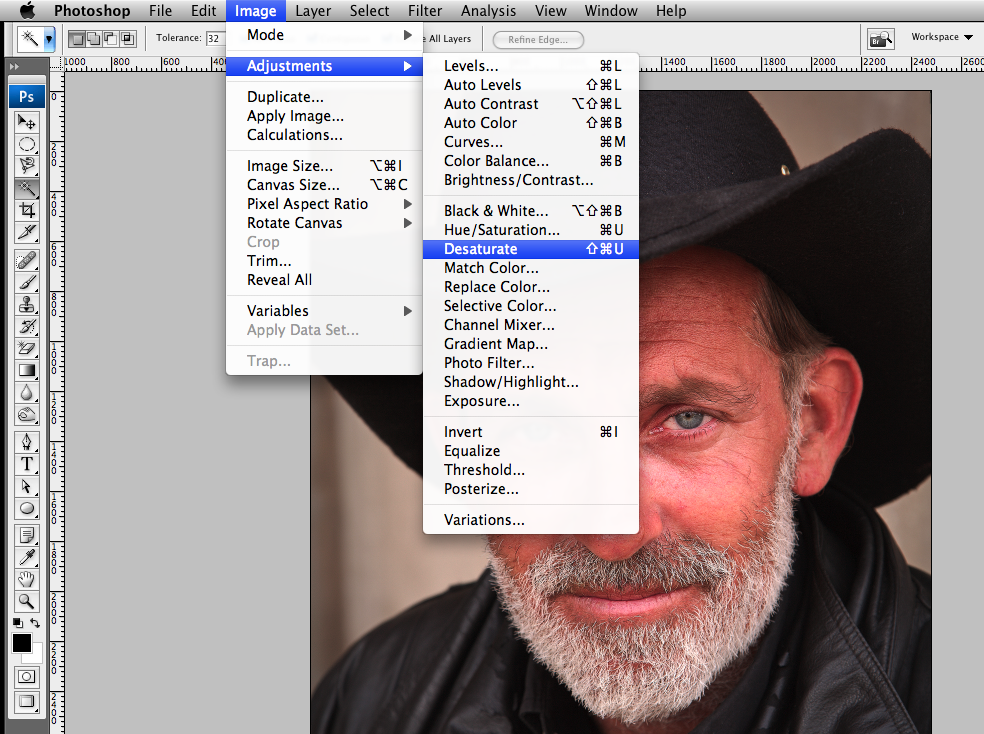
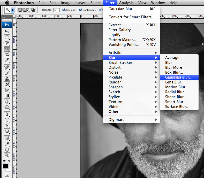
5. Now we are going to blur it. Go to the Filter menu --> Blur --> Gaussian Blur… Apply a blur of about 5 points; you can add more or less depending on the picture and the effect you want, but 5 points works pretty well as a basis.
*The next two steps will have two different versions a and b. Try both paths!
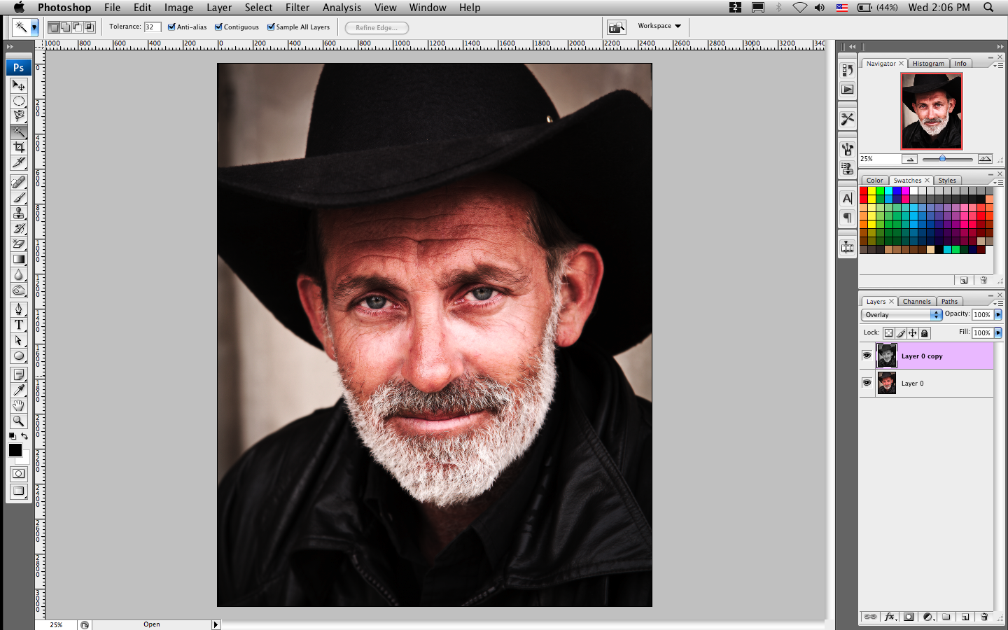
6a. Go to the layer blend drop down box (this is usually right under the Layer Tab and is default set to normal). Change the layer blend style to Overlay.
7a. Marvel at the transformation! The resulting affect is that shadows are deepened and the contrast between light and dark is increased, giving the picture a more intense look and feel to it. This effect can sometimes make the picture too bright. Lower the opacity on the copy layer to mitigate this.
Before:
After:
OR
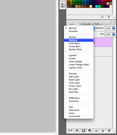
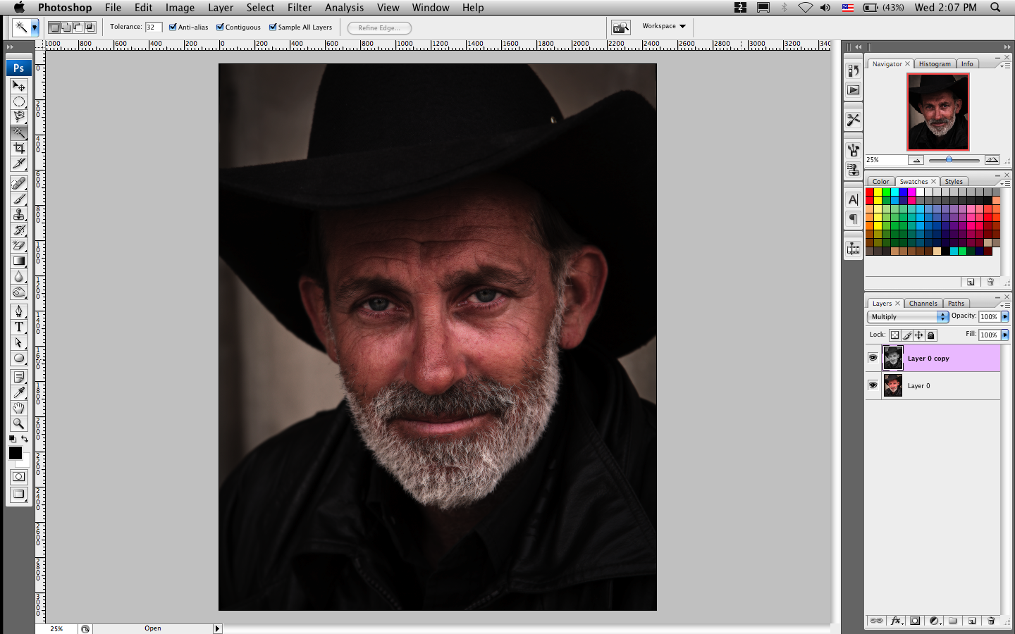
6b. Go to the layer blend drop down box (this is usually right under the Layer Tab and is default set to normal). Change the layer blend style to Multiply.
7b. Great! Unlike the first effect, this makes the picture darker and gives it a more somber and grittier look. This effect can often make a photo look too dark. Lower the opacity on the copy layer to your satisfaction.
Before:
After:
8. Yay, George is beautiful! Both effects are simple, but can make a significant difference on the impression your photos make on others. Adjust and mess around with the settings until you get a look you are satisfied with.
*CAUTION: While both effects look cool, they can be easily overdone and dramatized—just like reverb. Please use artistic forethought.
*All the steps used here can be reproduced in GIMP, a program similar to Photoshop (but completely free!). Be warned that there are some differences in the menus.


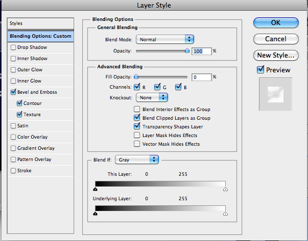 Next select the “Bevel and Emboss” option. Set Style: Inner Bevel, Technique: Smooth, Depth: 75%, Direction: Up, Size: 13 px, Highlight Mode: Normal and color white, Shadow Mode: Lighten and color white with opacity 90%.
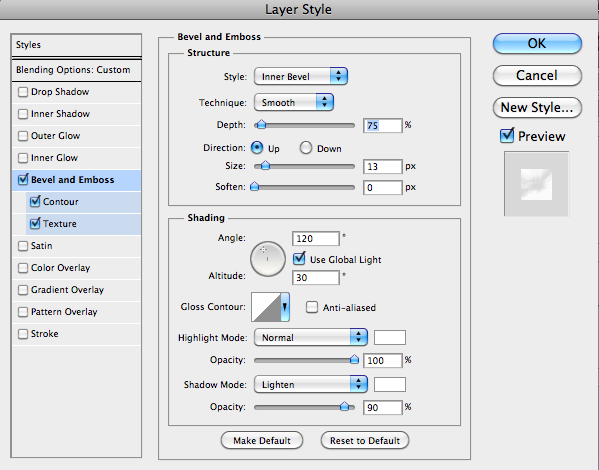 Select the Contour Make sure the Range is set to 50%.
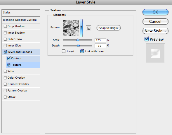
 Finally Select the Texture Option. Change the Texture to “Clouds,” Scale: 27%, and Depth: +15%.
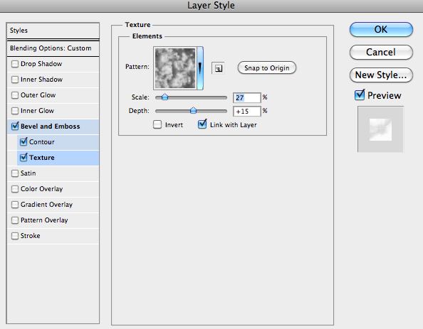 Ok we are halfway there as you can see it’s starting to look a bit frosty:
 And there you have it, some awesome frosty text to use!
 -Kat
-Kat